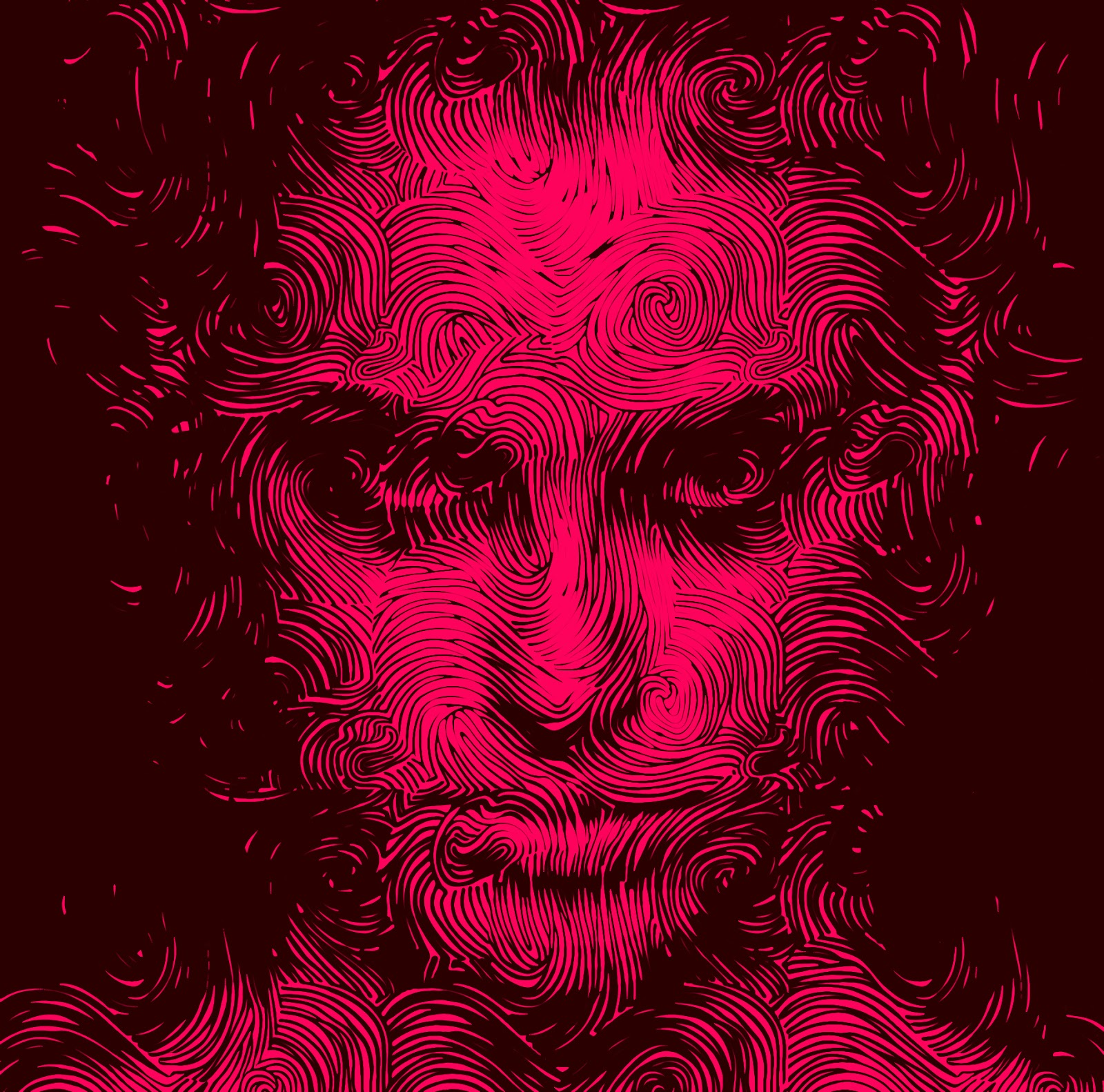
Image Saturation effect simply de-saturates your image in the normal mode and as soon as you hover over that image you will colours coming back and the image is once again saturated. Well we are not using any kind of JavaScript or stuff to do this effect but we will use the simple CSS transitions and saturation effect to achieve this awesome effect on your blogger image's.

So now you might be thinking what the hell is saturation and what effect I am talking about, well to make you more clear we have just enabled that same effect on the below image, just try to hover above the image and you will see colors coming back to the image, so basically this effect just makes the image Black and White and as soon as we hover over it the colors are back with a transition.
Add Amazing Colorizing Effect to Blogger Images
So now if you are clear about the effect we are talking about, lets see how you can apply this same effect to your blogger blog images, well applying this has three methods either you can add this effect to all the image by default or you can add this to only post body images or you can add this effect to any specific image by adding the class to that IMG tag, I will show you all three options.
Adding this Effect to your Entire Blog Images
In this step we can simply add the CSS code to apply to all images present in your blog, so lets see all the steps involved in achieving this effect.
- Open Blogger > Template > Edit HTML.
- Press
Ctrl +F & search for]]></b:skin>tag & paste below code above it.img{-webkit-transition: all 0.4s ease;-o-transition: all 0.4s ease;transition: all 0.4s ease;-webkit-filter: saturate(0.0);-moz-filter:saturate(0.0)}img:hover{-webkit-filter: saturate(1.1);-moz-filter: saturate(1.1)} - Now save your template and refresh your blog to see the result.
Adding this Effect to only Post Body Images
In case you only want this effect to appear in your post body, so all the images you add to your post should have this effect automatically applied, then follow below steps.
- Open Blogger > Template > Edit HTML.
- Press
Ctrl +F & search for]]></b:skin>tag & paste below code above it..post-body img{-webkit-transition: all 0.4s ease;-o-transition: all 0.4s ease;transition: all 0.4s ease;-webkit-filter: saturate(0.0);-moz-filter:saturate(0.0)}img:hover{-webkit-filter: saturate(1.1);-moz-filter: saturate(1.1)} - Now save your template and refresh your posts to see this effect.
Adding this Effect to any Specific Image
In case you just want to add this effect to any of your image whenever you want, then you can follow below steps to see how it can be done.
- Open Blogger > Template > Edit HTML.
- Press
Ctrl +F & search for]]></b:skin>tag & paste below code above it..saturate{-webkit-transition: all 0.4s ease;-o-transition: all 0.4s ease;transition: all 0.4s ease;-webkit-filter: saturate(0.0);-moz-filter:saturate(0.0)}.saturate:hover{-webkit-filter: saturate(1.1);-moz-filter: saturate(1.1)} - Now save your template and now when you compose any post and add images to it you simply hasv to add .saturate class to your img tag like below.
<img class='saturate' alt="demo" src='http://xxxxxxxxxxxxxxxx.png'/> - So as you can see the blue like above, you need to add this to all your IMG tag that you want to have this same effect.
I hope you understood the concept behind this effect, just make sure to try this effect, its worth it, I just loved this effect, it can really deliver some exceptional results, do let me know in the comments in case you find any issues using this effect, you can Contact Me to send your queries directly to me via email and do make sure to join our Telegram Channel to get all those sexy updates delivered to your instantly.

(COMMENTS WILL LOAD AUTOMATICALLY)